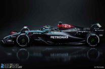
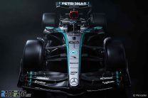
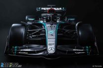
Mercedes have revealed the W15, their car for the 2024 season and Lewis Hamilton’s final Mercedes, at their launch event at Silverstone.
The team has presented a vastly revised car from its predecessor, the W14, which was only the third Mercedes produced F1 car in the modern era to fail to win a grand prix.The W15 again features a predominately black colour scheme, following on from last year’s car, but with silver returning to the front of the car along the nose. The 2024 car abandons the ill-fated ‘zero sidepod’ concept for a more Red Bull-esque approach to the current ground effect regulations.
The W15 will be the 12th and final Mercedes that Lewis Hamilton will drive for the team ahead of his blockbuster move to Ferrari for next season. Hamilton will again race alongside team mate George Russell for the third and final year.
Team principal Toto Wolff says that the W15 marks a “complete relaunch” for Mercedes for this season.
“We know we have a mountain to climb to fight at the very front. There are no miracles in this sport,” Wolff said. “But our ambition and determination are strong. Since charting this new course, development has progressed well. We had several items on our priority list for this car. We will soon see if we’ve made the step we’ve aimed for.”
Wolff says that the revised livery on the car for 2024, with the return of silver to the front of the car, is because the team were in a position to paint more of the car due to weight saving measures.
“Performance was always at the forefront of our minds with the black livery last year,” Wolff said.
“Weight is a crucial factor in this current generation of cars. We knew that, once we were in position to do so, we would bring back the Mercedes silver to accompany the black that has become a pillar of our team identity. The livery truly reflects who we are as a team with the distinctive colours of Ineos and and Petronas providing important highlights.”
Mercedes describe the shade of red used on the nose, rear wing and roll hoop in honour of team part-owners Ineos as ‘Toto rosso’. The car also features accents of green of title sponsors Petronas.
Mercedes will run the W15 later today for the first time in a shakedown run at the Silverstone circuit. The team finished second in the championship last season, far behind Red Bull, after jumping ahead of Ferrari in the standings. However, the team failed to win a grand prix last year for the first time since the 2011 season.
Pictures: 2024 Mercedes F1 launch
Advert | Become a RaceFans supporter and
Formula 1
- Pictures: Red Bull’s aggressive new sidepod design revealed in detail at test
- Pictures: New views of Mercedes W15 running in Bahrain test
- Pictures: 2024 F1 pre-season testing day one: Bahrain
- Pictures: Haas VF-24 officially presented as testing begins in Bahrain
- Driver line-up confirmed for sole pre-season F1 test


Patrick
14th February 2024, 10:43
It does look good. But now every car’s a Red Bull save the paint (or pin striping). Wonder if the 2024 RB is any different from the rest of the pack.
Derek Edwards
14th February 2024, 12:55
When you say RB I assume that you mean the Red Bull and not RB? Their naming fetish is so confusing..!
An Sionnach
14th February 2024, 21:10
In the case of Red Bull, “RB” means “Red Bull”.
When it comes to RB, however, “RB” means “RB”!
Tristan
14th February 2024, 23:43
What do you mean? They are so unique and different, totally unlike any other team!
Ben Rowe (@thegianthogweed)
15th February 2024, 9:13
RB means Red Bull.
RB means Racing Bulls.
It gets confusing!
I think that Red Bull won’t shorten their name and will vertually always be called Red Bull as their website is called redbullracing.com.
However, given Alpha Tauri’s new full name is Visa Cash App RB Formula One Team, it is very clear that although RB stands for Racing Bulls, they certainly will be known as just RB.
As Red Bull have this name even in their shortened website title, I think that if anyone says RB this seasn, it would make more sense if they were talking about the Visa Cash App team based on their official names.
Marcus (@marcusw)
14th February 2024, 13:38
It’s F1, and teams have always gravitated towards the proven best solution eventually, and have emulated features from other cars that they feel will benefit them. You can blame the organisers for giving teams so little room for creativity that we end up with similar looking cars. If you actually study the details though, there are many many subtle yet significant differences between most of them. On the new Mercedes for example the sidepod inlet is actually quite different to Red Bull. It’s certainly not a Red Bull clone as many people keep saying about most of the new cars.
T
14th February 2024, 19:44
you looked at this and thought red bull?
AlanD
14th February 2024, 23:59
There is an excellent video on youtube entitled
Mercedes’ major 2024 F1 car changes explained
which goes into a lot of detail about what’s been changed on the car. Interesting viewing for people into the tech rather than the paint jobs.
SteveP
15th February 2024, 18:44
So far, every car seems to be flashy/gaudy and rather OTT
The Merc seems to have a stylish, understated look. “Less is more” as the saying goes.
If the performance levels of all the cars matched their stylishness, the Merc would lap everything with a few laps.
There is no such correlation in F1, so we aren’t likely to hear RBR fans complaining about cheating and rocket ships, as in past years.
Paul (@frankjaeger)
14th February 2024, 10:46
Sexy shape like the Ferrari; paint job could be better
Jere (@jerejj)
14th February 2024, 10:48
I don’t mind about silver returning to an extent, & if anything, the silver-dark mixture looks nice.
Btw, who’s the driver beside Russell? Certainly, not Gutierrez, Antonelli, or Vesti, but someone I fail to recognize.
RandomMallard
14th February 2024, 11:00
@jerejj I think it is Vesti actually.
GeeMac (@geemac)
14th February 2024, 11:29
It’s 100% Vesti…
notagrumpyfan
14th February 2024, 14:51
The description/caption confirms this as well ;)
Jere (@jerejj)
14th February 2024, 18:21
I don’t know how or why, but even though I looked carefully & in larger view, I still somehow failed to recognize him despite having seen some images of him before & additionally, the caption description wasn’t in place yet, so I couldn’t have used that reference at the time.
Simon
15th February 2024, 1:30
Vesti’s name’s included in the first flippin’ thumbnail picture caption! Or cross-reference with another site? Sheesh…
rprp
14th February 2024, 11:16
I’m quite liking these 2024 nose cone/front wings.
Konstantinos
14th February 2024, 11:21
With a risk of repeating myself, one more simple mostly solid colour livery that looks (in my opinion) way better than some of the more messy complicated ones. Ferrari and Aston are others that follow a similar logic.
I think simplicity is one of the reasons why certain liveries are so iconic, like the classic mclaren marlboro one: simple solid colours, distinctive and recognisable. Same goes for helmets really, Villeneuve had some great ones, Senna’s one is iconic. Nowadays who remembers anyone’s helmet design? I shouldn’t speak for everyone but I certainly don’t.
MurasamaRA300 (@murasamara300)
14th February 2024, 11:39
Helmets I distinctly remember (showing my age very clearly):
Graham Hill, Emerson Fittipaldi, Ronnie Peterson, Francois Cevert, Ayrton Senna, Clay Regazzoni, Jackie Stewart, Jacky Ickx, Michael Schumacher, Jacques Villeneuve…
rprp
14th February 2024, 11:47
I think the problem today is that the helmets change so much. It’s no longer seen as a badge or identifier, just a piece of design.
Of the current drivers, I’d struggle to describe or draw any of them from memory.
Asd
14th February 2024, 12:47
No, that’s not the problem. Today’s helmet designs are very complicated and messy, chaotic, with blurred edges, colour gradients, dozens of lines going at all angles and all kinds of small details. That’s the problem. They are totally uncharacteristic and unmemorable no matter how much you look at them.
You will remember such helmets as Senna’s, David Coulthard’s, Graham Hill’s after 2 seconds of viewing.
I can’t remember a single F1 helmet from the last 20 years enough to be able to draw it.
Ferdinand
15th February 2024, 7:47
I agree here. Why this goes beyond the current drivers understandings I do not know. They are all so alike (and on top of that, that also goes for some liveries) I still have to browse quickly for he painted yellow camera on top of the car to see who is driving it.
On a related note Liberty should take note as well. Why should I pay and watch a sport that plugs drivers on social and through horrible vehicles like dts but during a race I can not distinguish one car from another. Seems to me a condition that has to be met before we even start racing at all. Mandatory car number in the same place and format would be a start, but I am sure some clever people can come up with something better.
Konstantinos
14th February 2024, 13:01
Those are all great! It’s with Schumacher’s whet it becomes a bit blurrier for me. I remember that it’s red but you can already see the messiness creeping in (for my taste of course) but it’s still recognisable.
Asanator (@asanator)
15th February 2024, 19:51
I think he means the original Schumacher helmet with the German flag.
Cronies
14th February 2024, 16:35
Vettels (post RB) probably the most memorable in 20 years time.
RAM
14th February 2024, 13:04
You are 200% correct. I prefer the silver merc to the black one. While I support the message the black car was trying to pass, Mercedes is about Silver Arrows.
Last year’s Mclaren was for me the WORST livery in the grid. A mix of orange, blue and black all over the place. Their last great papaya livery was when Alonso was still there.
God, I miss them chrome days…
Tommy Scragend
14th February 2024, 13:36
It’s OK, it can be silver again in 2025.
SteveP
14th February 2024, 19:26
I think you may need a thicker coat, your inner xenophobe is showing.
Patrick
14th February 2024, 15:11
What do you mean? Both this and last year’s Macs have Chrome written all over it!
Renee (@renee)
14th February 2024, 18:43
McLaren has had some pretty gorgeous looking cars. The best examples are the 2001 MP4-16 and the chrome 2011 MP4-26. The W15 even kinda looks similar to the 2001 McLaren livery. Looks pretty good IMO.
NinjaBadger (@ninjabadger)
14th February 2024, 11:51
From the front I get a very strong 2005 Mclaren vibe.
Blunt nose-cone, triangular sidepod inlets, silver down the centre with slight colour accent down the edge towards the cockpit, and black over the sidepods…
https://www.ultimatecarpage.com/images/car/2237/McLaren-MP4-20-Mercedes-16774.jpg
Bullfrog (@bullfrog)
14th February 2024, 13:46
Yes – same smart colours, SAP and Merc logos on the nose and even the front wing shape in the middle.
All it needs now is a driver named Kimi!
Maciek (@maciek)
14th February 2024, 12:13
Nice looking car
Ben
14th February 2024, 12:20
That’s a nice looking car! Loving the silver being back and shape of the sidepods.
Asd
14th February 2024, 12:37
YES!!!!!! A beautiful, single-curvature nose again!!! Best looking F1 car in front view so far!
The livery is excellent too, finally something fresh.
The colour scheme makes me think of Maserati MC12 from FIA GT:
https://www.snaplap.net/wp-content/uploads/2017/07/MaseratiMC12-Vitaphone_1.jpg
osnola
14th February 2024, 12:53
well the racism origin is gone already..
About the car… last years car was so ugly this can only be a better looking car.
The ugly airinlet in the sidepod is camouflaged by the color scheme.
Nope, not my car as far as looks go. Lets hope they solved the performance issues, way more important.
Marcus (@marcusw)
14th February 2024, 13:33
Well to be fair to them, their 2020 car was actually painted black, with the three pointed stars all over it as a pattern. It wasn’t done as a weight saving measure. Last year however, like most of the teams, they maximised the weight saving by simply omitting paint as much as possible, hence all the bare (black) carbon fibre, so Toto’s comment about last years car is reasonable.
Yellow Baron
14th February 2024, 15:53
I recently discovered it’s only a 1kg saving over a full colour car which was a shock, as I thought the teams were ruining their identity/livery for a good few kilos. Which would be understandable.
Renee (@renee)
14th February 2024, 18:49
What is it that Martin Brundle often repeats? 1 extra kilo costs you 2 tenths a lap? Or 1 tenth? Sometimes drivers run without the drinks pouch in the car to save weight. That is insane. So I imagine gaining a tenth a lap (around 1 minute over a race distance) just by leaving the paint off the car seems the cheapest gains you could have in F1.
RH
14th February 2024, 23:03
10 kilos is worth 3 tenths over a lap. So 1 kilo is worth less than half a tenth which would be 2s over a 50 lap race distance. I am sure Mercedes wish they were 2s off from the winning team in every race last year.
This car has many innovations, and I look forward to it.
notagrumpyfan
14th February 2024, 23:16
600 laps within two hours might be a challenge though ;)
Renee (@renee)
15th February 2024, 19:08
Whoops, seems my math let me down there a bit lol. Still, even 6 seconds over a race distance has often been the difference between a win and 2nd.
And as to 10 kg = 3 tenths over a lap. That doesn’t sound familiar. Why would any driver then forego their drink in the car? Did some research. Brundle says 1 liter of extra fuel =~1 tenth a lap.
MichaelN
14th February 2024, 14:14
The render (?) looks pretty cool. The silver is a nice touch. The yellow Pirelli and the super glossy surface on the actual photo make it a bit more messy. But anyway, so long as it can be competitive… F1 desperately needs some competition for race wins.
Phil Norman (@phil-f1-21)
14th February 2024, 15:16
Looks good. The Mercedes, Ferrari, McLaren and Aston all look pretty good. Difficult to pick a favourite. Certainly better than any of the other cars.
I think the Mercs colours give it the impression of appearing slightly shorter from a side view, than other cars. I realise it is an illusion. I just hope they can all be more competitive compared to the Red Bull (A team).
Phil Norman (@phil-f1-21)
14th February 2024, 15:21
It’s very noticeable how the front wings of each car are all very different to each other.
Asd
14th February 2024, 15:53
Ferrari is ugly as hell. Don’t confuse the nice livery with the ugly car.
Phil Norman (@phil-f1-21)
14th February 2024, 17:40
No I disagree. I don’t think I would call the Ferrari ugly. I think the Merc is certainly a cleaner and tidier design and it looks more compact.
Renee (@renee)
14th February 2024, 18:59
To me the Ferrari looked pretty good as well. Except something is weird about the nose and front wing looking from the front 3/4 view. From the front the nose looks good, but from front side view the nose looks too long and weirdly curved down (sorry not fluent in English) and weirdly empty under the nose cone.
An Sionnach
14th February 2024, 16:16
That’s an improvement. I like the silver. Would be nice if it was all silver. I don’t like the Petronas blue, either, but it works here too some extent between the silver and black.
Simon
15th February 2024, 1:34
Petronas loves the Petronas blue, though?
pcxmac (@pcxmac)
14th February 2024, 17:47
I dunno, if that exhaust is still plumbed as it was last year, they will still be under powered and consuming extra fuel to help cool down the combustion chamber. Ferrari’s intake and upper shroud/body work looks a lot better. Will be interesting to see if the Exhaust is still routed the same as before, which would pretty much end any title hopes.
pcxmac (@pcxmac)
14th February 2024, 17:52
… no shots of the rear too, meh. Kinda disappointing, hard to gauge how good they did tightening up the rear end without some shots of the boot.
Also, the whole budget cap thing, they should have taken a penalty like RBR. Theres really no excuse not to break that rule.
PJ Gaudie (@moogleslam)
14th February 2024, 22:20
This is the best looking Mercedes since they came back to the sport.